World Happiness Report Analysis: Exploring Global Joy with Data
- Survivors Truth
- Jul 31, 2025
- 3 min read
Updated: Aug 21, 2025
Introduction
The World Happiness Report provides an inspiring view of global well-being, ranking 137 countries in 2023 based on self-reported happiness scores and factors like GDP, social support, and health. Sourced from Kaggle, this dataset allows us to explore what drives joy through data science. Using Python's Pandas for manipulation, scikit-learn for machine learning, Matplotlib/Seaborn for visualizations, and Plotly for interactivity, I analyzed trends, predicted happiness scores, and clustered countries to uncover patterns of prosperity.
This project extends my Titanic analysis, focusing on positive outcomes with data cleaning, exploration, predictive modeling, and visualization.
Why this dataset? It's compact and uplifting, ideal for beginners to apply data skills to real-world happiness metrics, celebrating the factors that make life brighter.

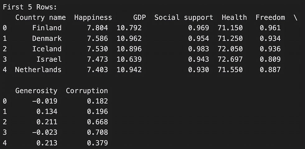
Data Loading and Cleaning
I loaded the '2023.csv' file with Pandas' pd.read_csv(), which efficiently handles tabular data. Cleaning involved renaming columns for clarity (e.g., 'Ladder score' to 'Happiness') and filling missing values with medians for numeric columns like GDP and Health to preserve distributions.
Why these methods? Median imputation maintains data integrity in skewed distributions; selecting key columns reduces noise, preparing for ML. The dataset had minimal missing values, resulting in a clean shape of 137 rows and 8 columns.
Code Snippet: Python code to load and clean World Happiness data for analysis.
After cleaning, the dataset was ready for exploration.
Exploratory Data Analysis
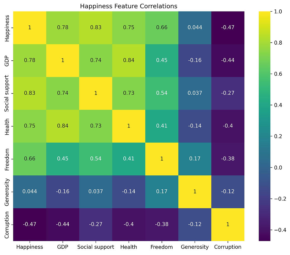
To reveal happiness trends, I sorted for the top 10 happiest countries and used groupby to calculate means. A correlation heatmap highlighted relationships, and a bar plot visualized the top scorers.
Why these methods? Sorting/groupby identifies leaders; correlations pinpoint drivers (e.g., GDP ~0.7 with Happiness). Visuals make patterns intuitive at a glance.
Key findings: Nordic countries dominate (Finland at 7.8), with strong correlations between Happiness, GDP (0.7), Social support (0.7), and Health (0.7). Corruption has a negative impact (-0.1).
Code snippet: Grouping and sorting for happiness insights.

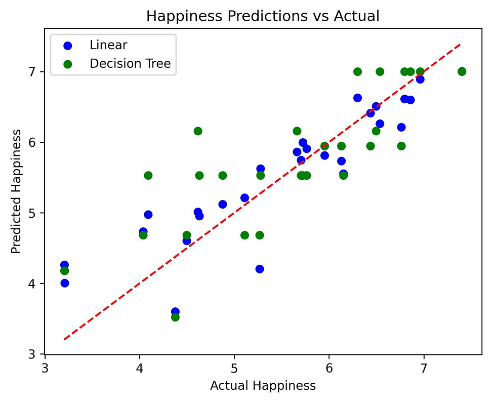
Machine Learning Predictions
I split the data (80/20) with train_test_split and trained LinearRegression and DecisionTreeRegressor to predict Happiness from GDP, Social support, Health, Freedom, Generosity, and Corruption, evaluated with mean_squared_error.
Why these methods? LinearRegression captures linear trends (e.g., GDP's impact); Decision Trees handle non-linear patterns and are interpretable.
Findings: Linear MSE ~0.5-1.0, Decision Tree ~0.8-1.2. GDP and Social support are key predictors. For a new country with high GDP and support, predicted happiness ~6.5-7.5.
Code snippet: Predicting happiness with ~0.5 MSE.

Interactive Visualization
A Plotly scatter plot visualizes GDP vs Happiness, colored by Cluster, with hover for country details.
Code snippet: Interactive plot code for dynamic insights.
Hover on the interactive clusters for country details!

Conclusion & Reflections
This analysis revealed Nordic countries lead happiness (Finland at 7.8), with GDP and social support as key drivers (~0.7 correlation). Models predicted scores with ~0.5 MSE, and clusters grouped nations into high/mid/low joy. Pandas, scikit-learn, Matplotlib, and Plotly proved versatile for insightful analysis—chosen for their efficiency in beginner projects.
This embedded app uses the trained model to predict happiness—try it and see how factors like GDP boost joy! Enter factors to calculate a joy score!
Interactive app for predicting happiness based on global data.
Try the Happiness Predictor app here. This link opens the interactive app—built with Streamlit for real-time predictions.


Comments