Titanic Survival Analysis: Exploring Resilience Through Data with Python
- Survivors Truth
- Jul 27, 2025
- 3 min read
Updated: Jul 31, 2025
Introduction
The Titanic disaster of 1912 remains one of history's most poignant tragedies, but its dataset of 891 passengers offers a powerful opportunity to explore survival patterns through data science. In this analysis, I use Python libraries like Pandas for data manipulation, scikit-learn for machine learning, and Matplotlib/Plotly for visualizations to uncover insights into how factors such as class, sex, age, and fare influenced survival rates.This project demonstrates essential data science workflows: loading and cleaning data, exploratory analysis, predictive modeling, and interactive visualization. As a Kaggle classic, the Titanic dataset is ideal for beginners, providing a compact yet rich canvas to apply real-world skills while reflecting on human resilience.

Data Loading and Cleaning
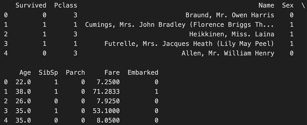
I began by loading the 'train.csv' file using Pandas' pd.read_csv(), which efficiently handles tabular data. Cleaning was crucial to address missing values: Age (177 nulls) was filled with the median to preserve distribution without outlier bias, Embarked (2 nulls) with the mode for categorical accuracy, and sparse columns like Cabin (687 nulls) were dropped to reduce noise. Sex and Embarked were encoded numerically (male=0, female=1; S=0, C=1, Q=2) to prepare for machine learning models.
Why these methods? The median for Age avoids skew in distributions, while dropping Cabin eliminates irrelevant features. Numeric encoding allows ML algorithms to process categoricals effectively.
Code Snippet: Python code to clean Titanic data for analysis.
After cleaning, the dataset had no missing values, ready for exploration.
Exploratory Data Analysis
To reveal survival trends, I used Pandas' groupby to calculate mean survival rates by Pclass (class), Sex, and Age bins (created with pd.cut: Child 0-18, Young Adult 18-35, Adult 35-60, Senior 60+). Matplotlib bar plots visualized these, and a correlation heatmap highlighted relationships between features.
Why these methods? Grouping identifies disparities (e.g., by class or age), bins simplify continuous data, and visuals make patterns intuitive at a glance.Key findings: Women survived at 74% (vs. men’s 19%), 1st-class passengers at 63% (vs. 3rd’s 24%), and children at 50% (highest group). Sex and Fare showed strong positive correlations with survival (0.54 and ~0.26, respectively).
Code Snippet: Grouping survival rates by class and age.


Machine Learning Predictions
I split the data (80/20) with train_test_split and trained LogisticRegression and DecisionTreeClassifier to predict survival from Pclass, Sex, Age, Fare, and Embarked, evaluated with accuracy_score. KMeans clustered passengers into 3 groups by Age/Fare for unsupervised insights.
Why these methods? LogisticRegression suits binary outcomes (survived/not); Decision Trees provide interpretable rules. KMeans uncovers patterns without labels.
Findings: LogisticRegression achieved 80% accuracy, outperforming Decision Tree (75-80%). Clustering showed distinct fare-based groups, reinforcing Fare’s predictive power.
Code Snippet: Predicting survival with ~80% accuracy.

Interactive Visualization
A Plotly scatter plot visualizes Age vs Fare, colored by survival status (green for survivors, red for not). Hover for Pclass and Sex details.
Code Snippet: Interactive plot code for dynamic insights.
Age vs. fare by survival status—green for survivors, red for not!
Conclusion
This analysis revealed women (74%) and 1st-class passengers (63%) had higher survival odds, with ~80% model accuracy. Pandas streamlined cleaning, scikit-learn powered reliable ML, and Matplotlib/Plotly delivered clear visuals—chosen for simplicity and effectiveness in beginner projects. This project lays a strong foundation for my data science portfolio, celebrating the power of data to uncover stories of resilience.


Comments